Build a Checkbox Component With Vue 3, Font Awesome, & Tailwind CSS
Takeaway:
Get your feet wet with some of the new Vue 3 features while building a fully functional checkbox component. We’ll be using Font Awesome to replace the default html checkbox and Tailwind CSS to handle styling.
Code Sandbox:
To make it easy to code-along, I’ve put together a couple code sandboxes.
- Starting Point 👈 Fork this one to code along
- Final State 👈 tl;dr
Lets get started
In the Starting Point sandbox we’ve got a basic checkbox input set up in ./components/checkbox.vue
<template>
  <input type="checkbox" :id="fieldId" class="mr-2" />  <label
    :for="fieldId"
    class="flex flex-row items-center font-bold cursor-pointer"
  >
    {{ label }}
  </label>
</template><script>
export default {
  props: {
    label: String,
    fieldId: {
      type: String,
      required: true,
    },
  },
};
</script>
We’re importing the checkbox.vue component into App.vue like so:
<check-box fieldId=”volume” label=”Volume On” />It seems to be working great. Only thing is, this checkbox is not tied to any data 😱
We’ll take the following steps to get this checkbox working:
- Add data to
App.vueand usev-modelto tie the data to<check-box> - In
checkbox.vuesync the<input>checkedprop to the value passed in byv-model - Replace the default checkbox with Font Awesome icons
Step 1
To add the data to App.vue we could use the Options API, which would be what you’re used to if you’ve been using Vue for a while now.
But for the sake of learning something new, let’s use Vue3’s Composition API.
Everything bold in the code snippet below is what we’ll add to App.vue
<script>
import Checkbox from "./components/checkbox.vue";
import { ref } from "vue";export default {
  name: "App",
  setup() {
    const volumeOn = ref(true);
    return {
      volumeOn,
    };
  },
  components: {
    "check-box": Checkbox,
  },
};
</script>
setup() is the entry point for the composition API.
We declare our variable volumeOn and make it reactive by using ref() Notice that we need to import ref in order to use it. More on refs and reactivity here, it is vital read up on this aspect of Vue3.
We return volumeOn in order for the template to access the variable.
Let’s use v-model to bind the variable to the checkbox component.
<check-box
  fieldId="volume"
  v-model:checked="volumeOn"
  label="Volume On"
/>
With Vue3 we can now pass arguments tov-model! We are passing checked as an argument. If we omitted this argument, volumeOn’s value would be passed to the child component as value — but in our case checked will be passed. Its worth noting that v-model arguments allow for multiple v-models to be used on a component. More on that here.
Step 2
We need to update our checkbox.vue component to utilize the data we are passing in. First we’ll add a prop called checked with the expected value type to be a Boolean This will catch the value passed by v-model:checked
<script>
export default {
  props: {
    label: String,
    fieldId: {
      type: String,
      required: true,
    },
    checked: {
      type: Boolean,
    },
  },
};
</script>
Now let’s tie the input’s checked property to our checked prop.
fyi 👉 :checked is shorthand for v-bind:checked
<template>
  <input
    type="checkbox"
    :checked="checked"
    :id="fieldId"
    class="mr-2"
  />
  <label
    :for="fieldId"
    class="flex flex-row items-center font-bold cursor-pointer"
  >
    {{ label }}
  </label>
</template>
Test it out by changing const volumeOn = ref(true); to false and reloading. The checkbox should now be unchecked by default.
It looks like everything might be working alright, but let’s see if the value of volumenOn is changing at all when we click the box.
The quickest way in codesandbox would be by adding {{ volumeOn }} to the template somewhere.
Spoiler alert, the value does not change 😥 We need to emit the checked value from the checkbox component to sync the value
<input
    @input="(event) => $emit('update:checked', event.target.checked)"
    type="checkbox"
    :checked="checked"
    :id="fieldId"
    class="mr-2"
  />
update:checked is a custom event synced to v-model:checked event.target.checked is the value we’re passing.
Now everything should be working with our checkbox.
If {{ volumeOn }} is not showing the proper value at this point, reload CodeSandbox, it should work fine.
Step 3
Finally, let’s get rid of those default checkbox styles, and replace them with Font Awesome icons.
We’ll add an icon in the label tag in checkbox.vue and hide the input with a Tailwind CSS class.
<input
    @input="(event) => $emit('update:checked',event.target.checked)"
    type="checkbox"
    :checked="checked"
    :id="fieldId"
    class="mr-2 hidden"
/>
<label
    :for="fieldId"
    class="flex flex-row items-center font-bold text-gray-800 cursor-pointer select-none"
  >
  <i class="fa fa-check-square text-blue-600 mr-2"></i>
  {{ label }}
</label>
Here’s how the icon break down:
faprovides all the default font awesome stylesfa-check-squarewill give us a nice little check in a square, there are thousands of icons to pick from, check them out heretext-blue-600is a Tailwind CSS class, see all the options they have heremr-2will give us a little right margin
But wait; we don’t want a blue checkbox when the checkbox is unchecked. Let’s add some logic to this class list for an unchecked box using Vue.
<i
  class="fa mr-2"
  :class="{
    'fa-check-square text-blue-600': checked,
    'fa-square text-gray-500': !checked,
  }"
></i>
We’ve added :class for any dynamic classes which will allow us to utilize our component’s props or other data to determine which classes to use. Learn more here.
And there you have it, a fully functional checkbox component.
🔥 Update 🔥
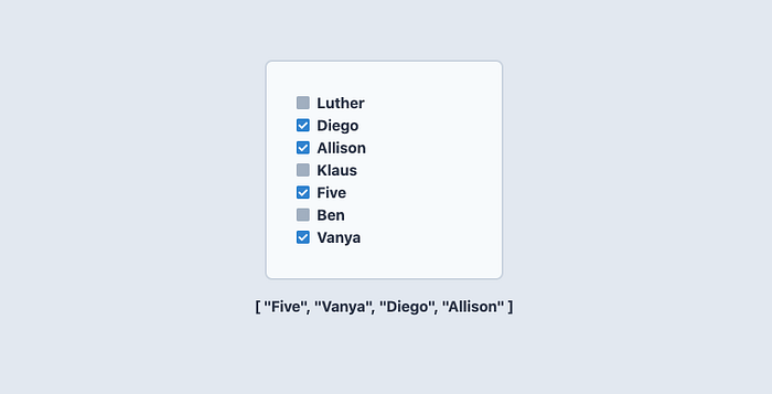
Want to bind multiple custom checkboxes to the same array?
We can achieve this with just a few adjustments to our code for the single checkbox. Check it out here


